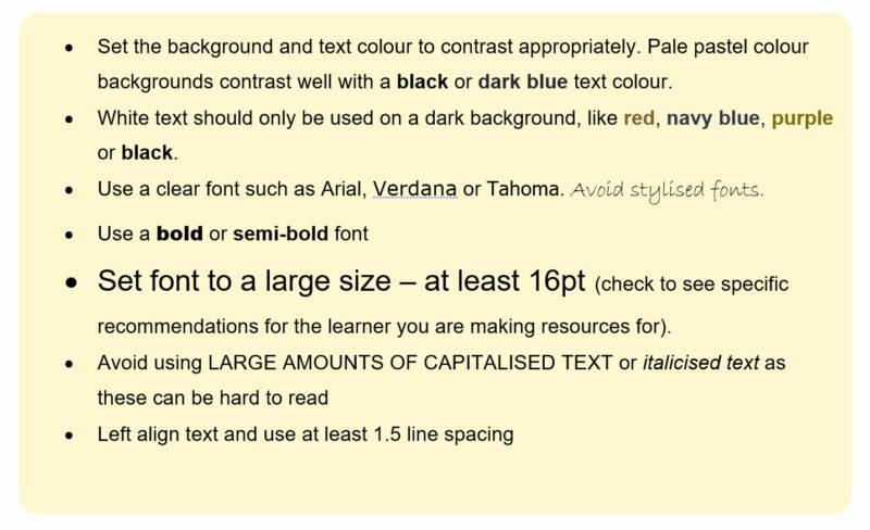
Set the background and text colour to contrast appropriately. Pale pastel colour backgrounds contrast well with a black or dark blue text colour.
- White text should only be used on a dark background, like red, navy blue, purple or black.
- Use a clear font such as Arial, Verdana or Tahoma. Avoid stylised fonts.
- Use a bold or semi-bold font
- Set font to a large size – at least 16pt (check to see specific recommendations for the learner you are making resources for).
- Avoid using LARGE AMOUNTS OF CAPITALISED TEXT or italicised text as these can be hard to read
- Left align text and use at least 1.5 line spacing
Reducing workload and written content
Sending presentations
Sending class PowerPoints / SMART notebook files / handouts to students digitally prior to the lesson can be hugely beneficial. This would allow them to:
- Add their own notes to existing content
- Spend extra time on specific parts / revisit afterwards
- Zoom in on different sections / make font size larger
- Copy and paste relevant parts into their own notes.
Personal devices
Being able to use a mobile device to take photos of the board can be helpful. Photos taken can upload automatically to OneDrive / Google Drive and then added to Word / OneNote, etc. quickly and easily (with a little practice). Some tasks, like homework and reminders, are often given at short notice and can be challenging for children with physical difficulties to manage and cause anxiety. A device that can take a quick picture of the board may help to reduce this.
Screenshots
If screen sharing software is being used then screenshots of select pages can be taken and added in to notes:
- On a Windows device press the ‘PrtScn’ key or ‘Windows logo key + Shift + S’.
- On an iPad, depending on your model, you press the power button + home button or power button + volume button at the same time.
- On a Chromebook you would press ‘CTRL + Shift + Show Windows key which looks like three rectangles layered on top of each other .